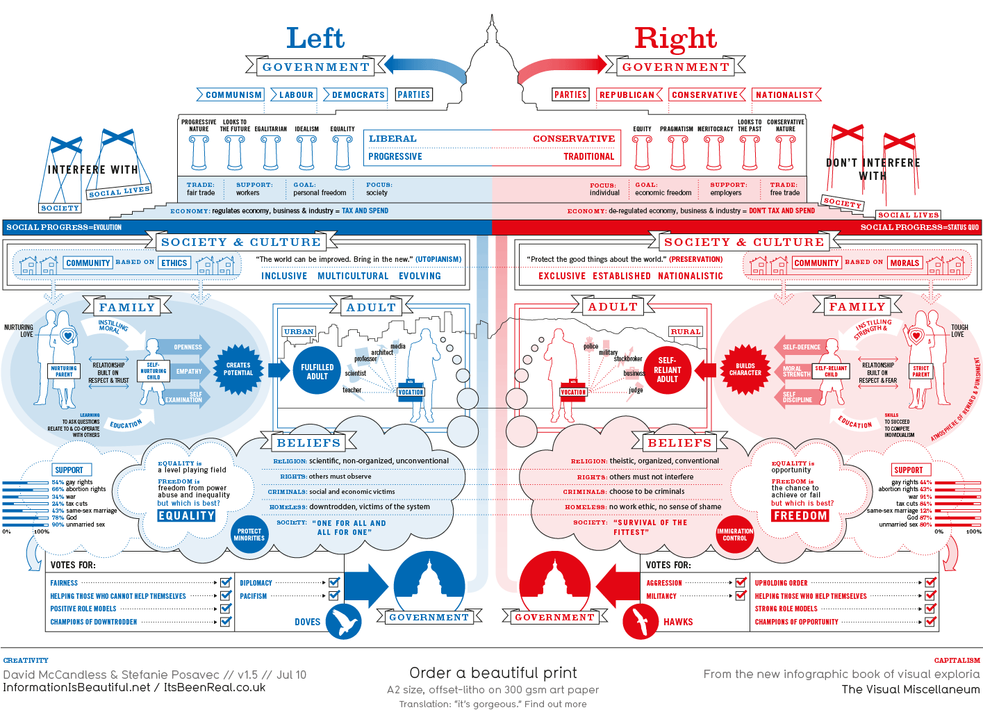
I first came across Information is Beautiful when I was looking for a diagram to explain political persuasions (right and left wing) and came up with the diagram on Google Images:
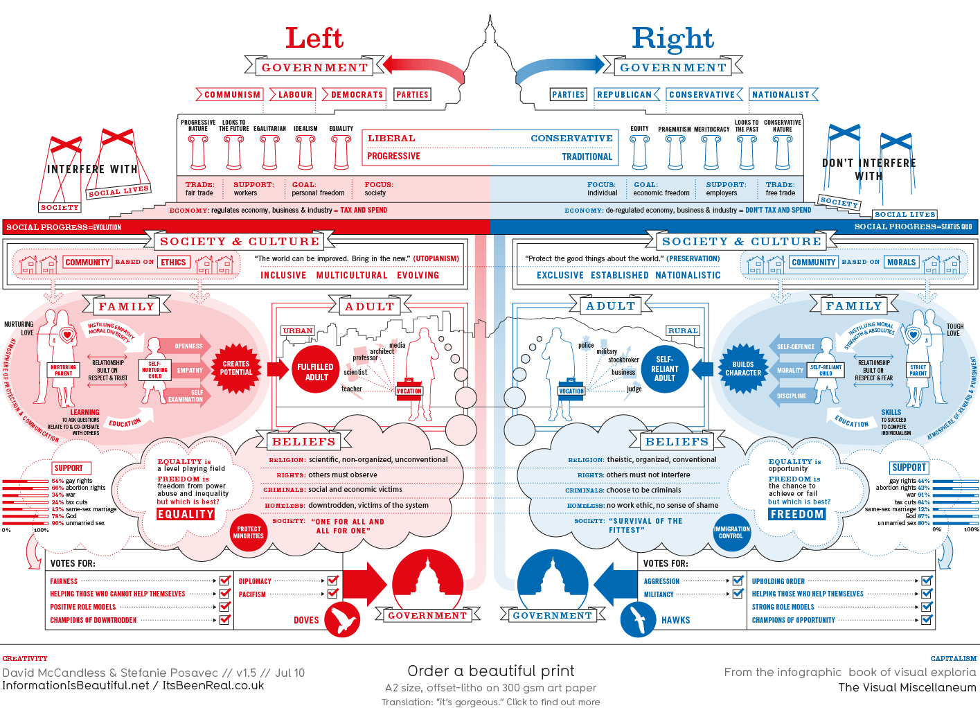 |
| Left vs Right (World) |
 |
| Varieties of Intimate Relationships |
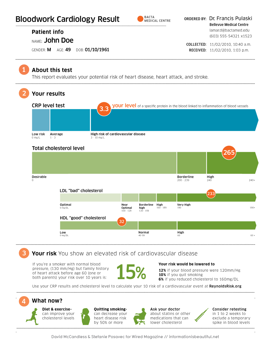
If you want to see the original blood test form.
They often (quite generously I think) tell you how they did it too. Recently they have sent out requests to see if people are interested in learning how to visualise data and research it. This might be as an individual or as a company. I've signed up for information in the hope they might follow through, if it's not too expensive! They also link examples they have found on their homepage with other organisations, great if you want to see how other people/companies/organisations work with data. This is one of my favourites:
A video of Energy and Dynamic Breaking:
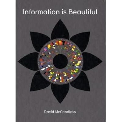
I have had my eye on their book for ages and when I got book tokens for Christmas (thank you relatives!) It's brilliant for just flicking through. There is a lot to be said for making information accessible to all and not burying people under incomprehensible data and numbers. I treated myself:
What do you think of visualisations? Do you know any good ones? Link some below if you do.
 |
| Facebook Break-up Times |

No comments:
Post a Comment